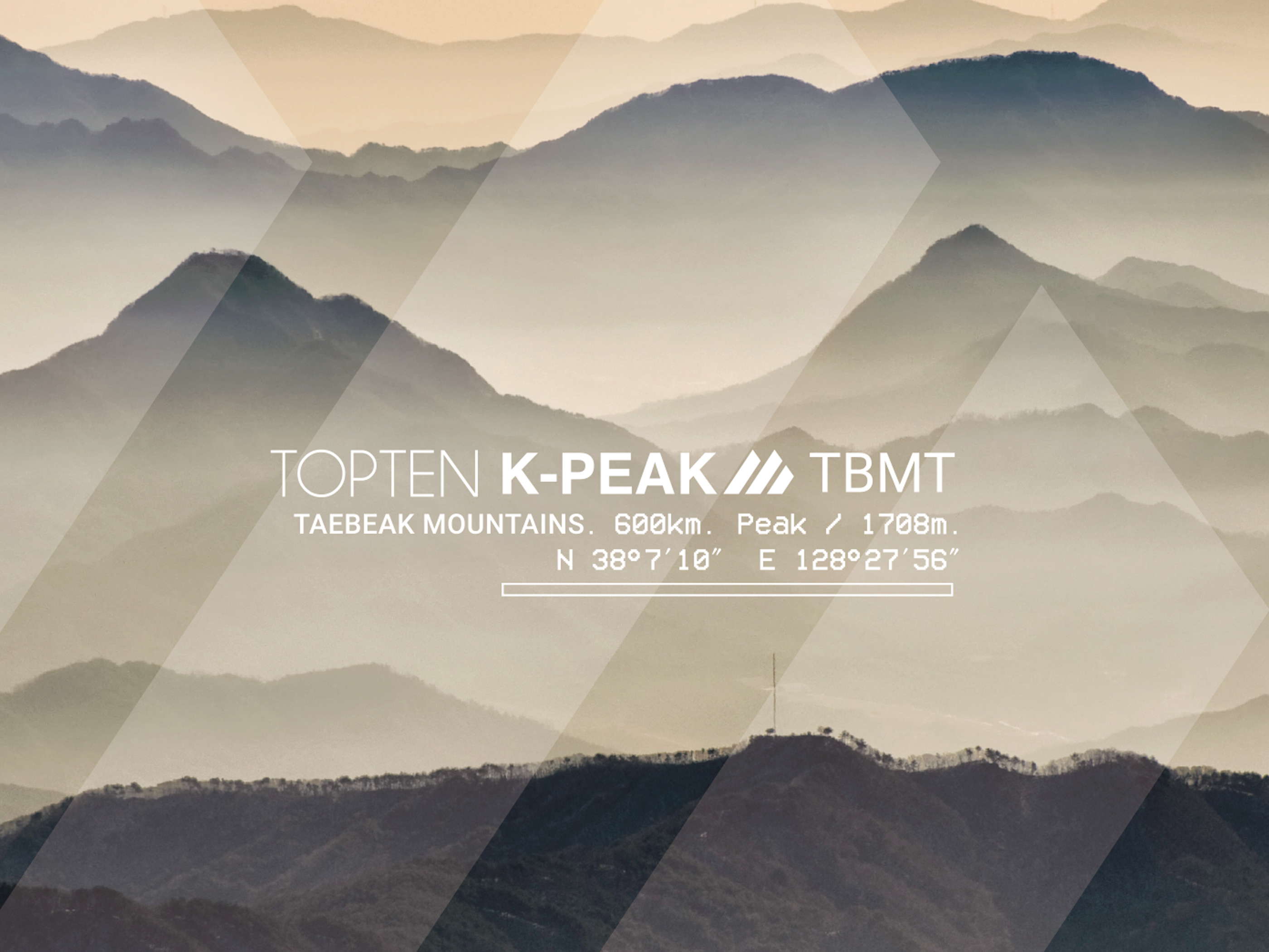
Project : TOPTEN active line logo design
Designer : Sooyoung Park
Designer : Sooyoung Park
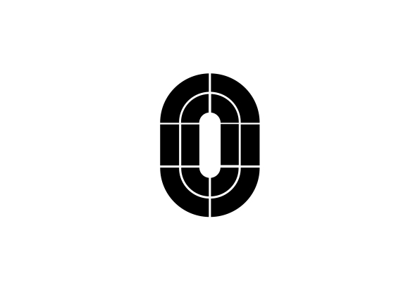
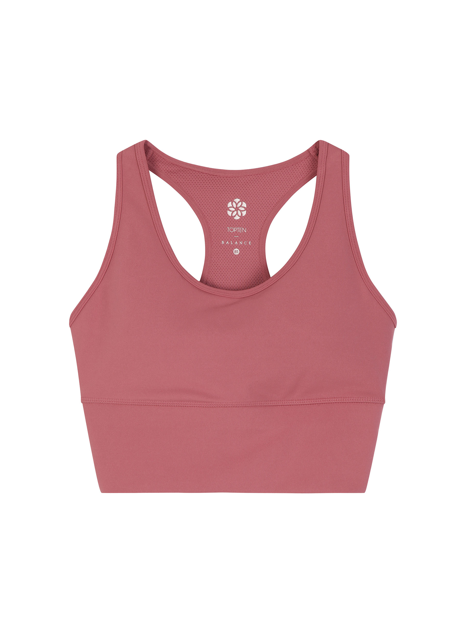
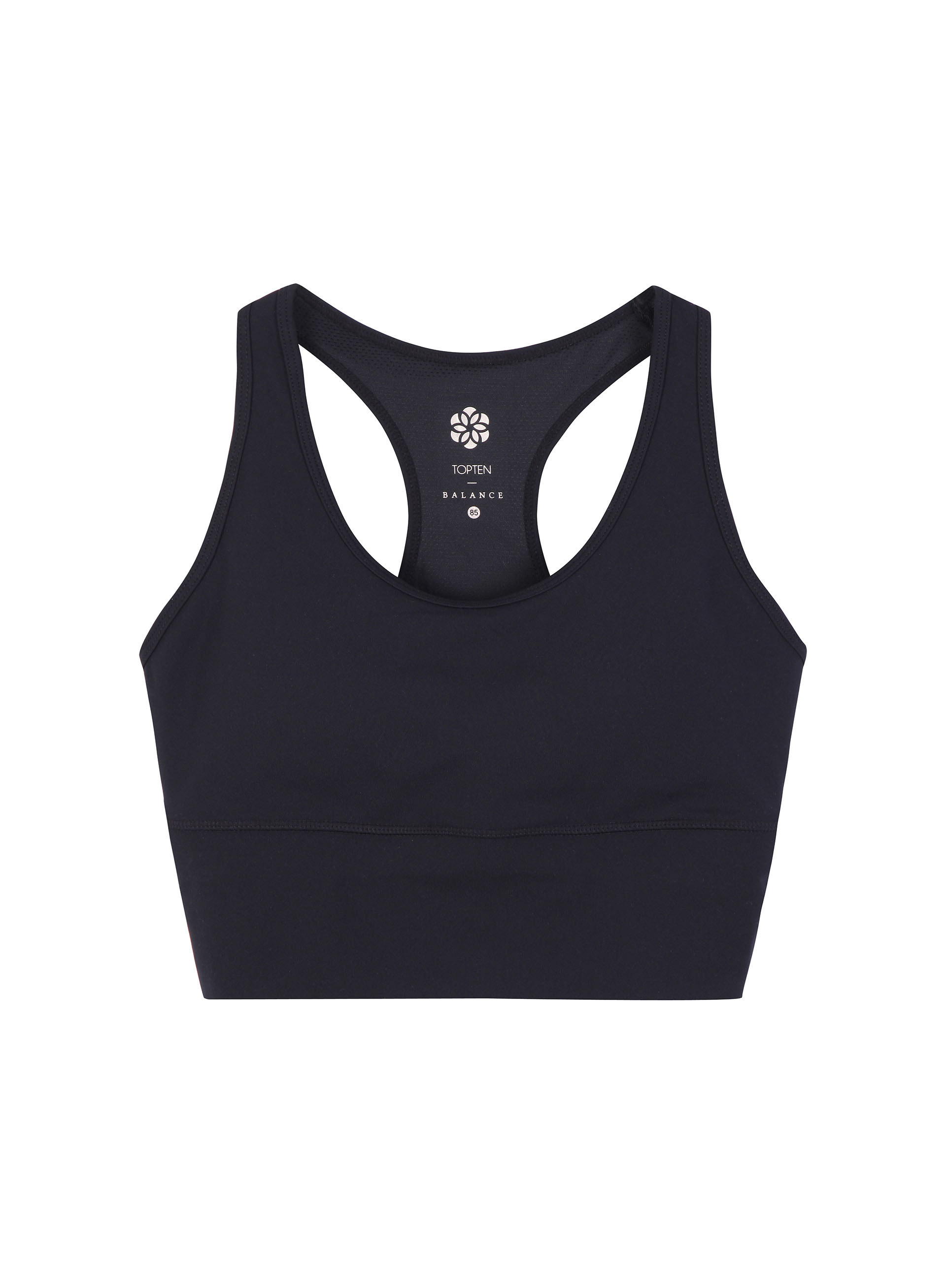
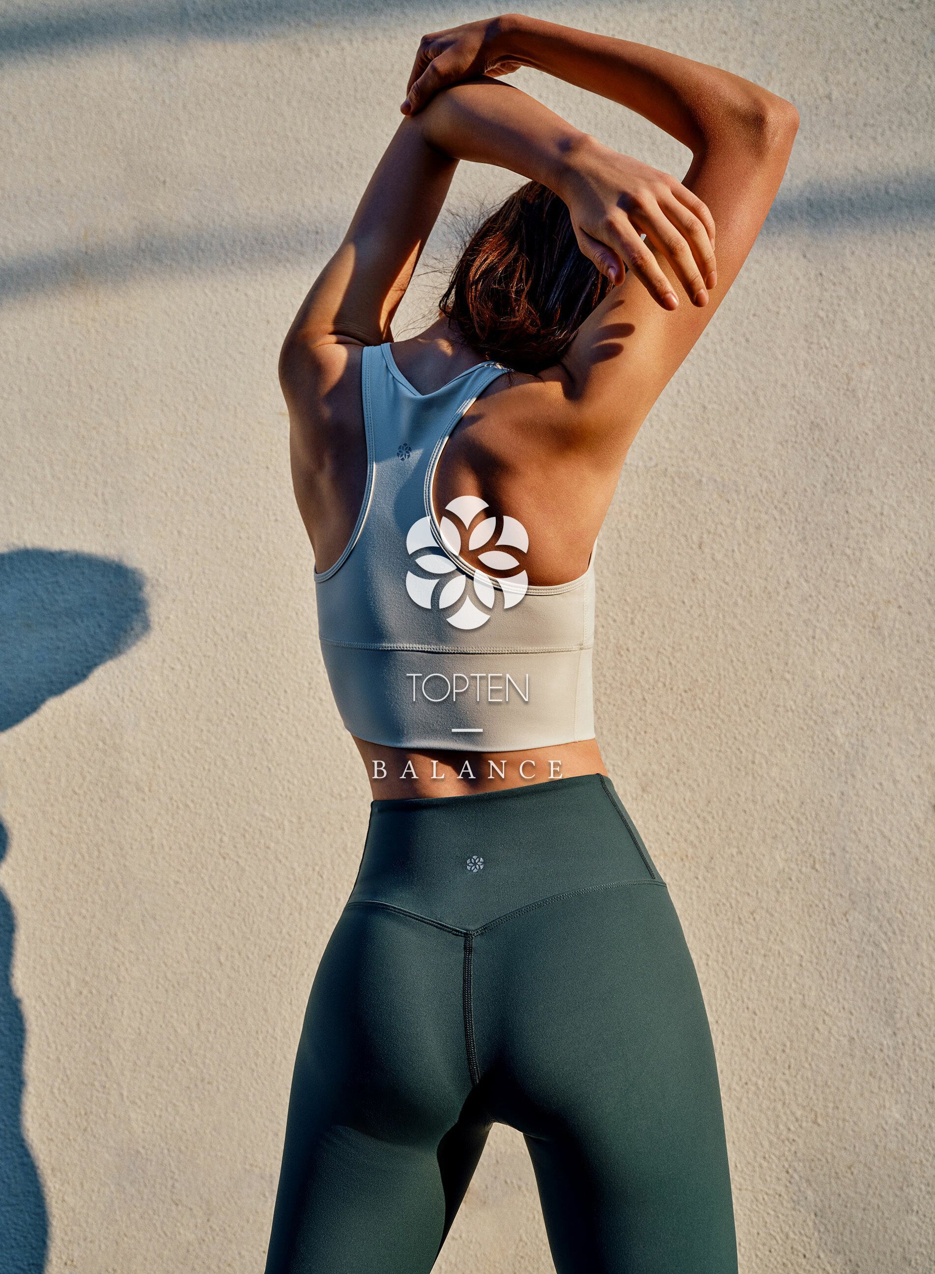
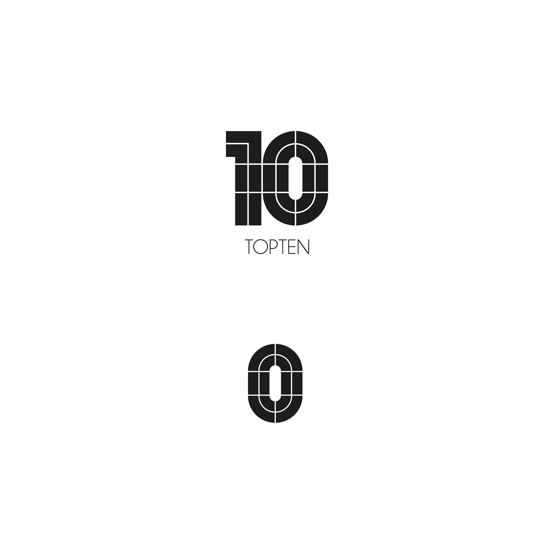
‘0’ from original TOPTEN logo is divided in 12 pieces which means 12 months and TOPTEN would deliver essential and trendy items to theire customers every month for a year as a SPA brand.
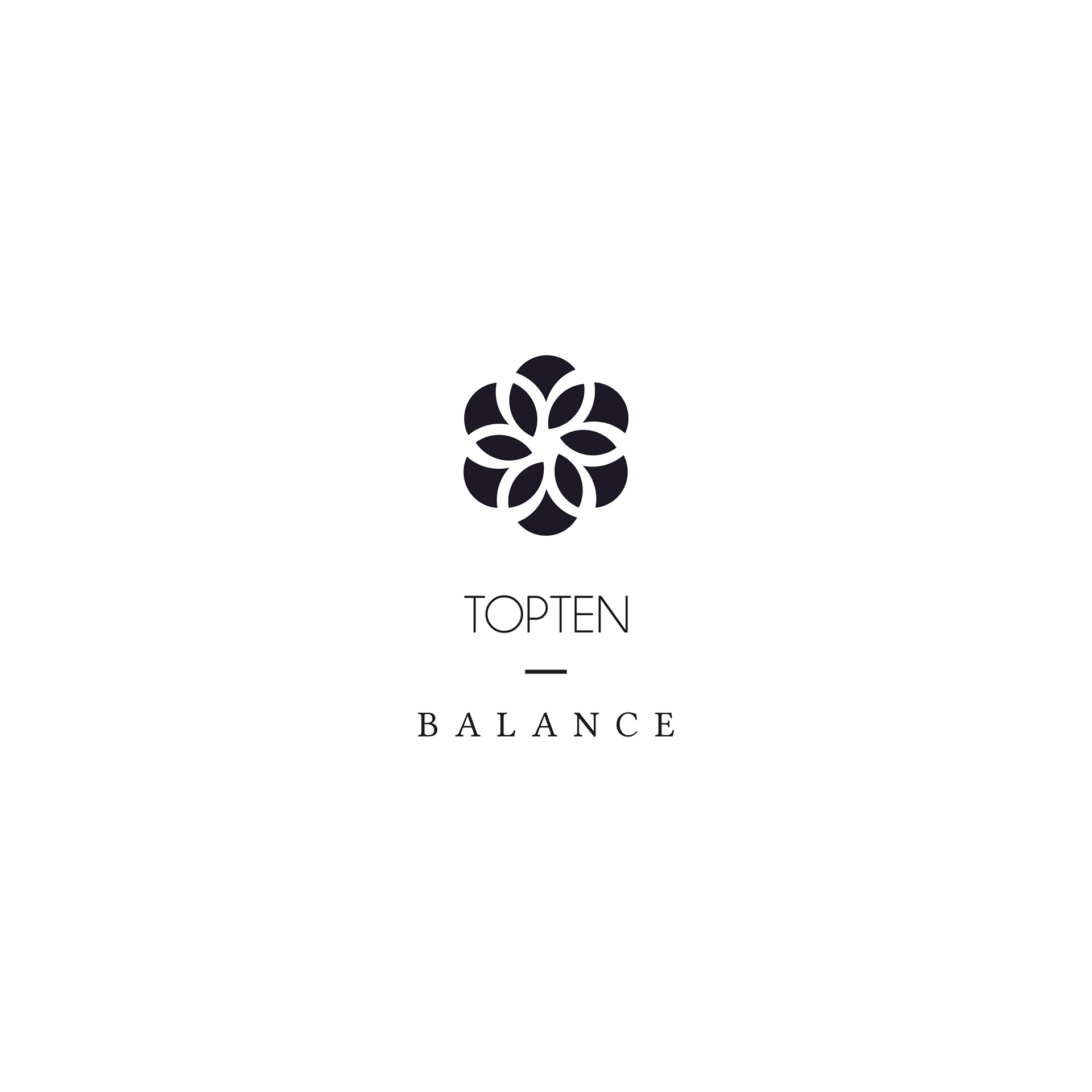
Tried to keep this motto of the brand and simply transformed it to have more feminine and athleisure mood.
Tried to keep this motto of the brand and simply transformed it to have more feminine and athleisure mood.
Changed the square shape to floral one and re-arranged them to be associated with oriental lotus which fits best to women's active line.
탑텐의 로고의 0 은 12조각으로 나뉘어져 있으며 이는 SPA 브랜드로서 1년 동안 매월 마다 가장 트렌디하면서도 에센셜한 아이템을 소비자에게 제공하겠다는 브랜드의 모토를 담고 있다. 이러한 의미를 최대한 유지하면서 여성 액티브 라인에 어울릴 수 있도록 변형하는데 주안점을 두었다. 단순했던 사각 조각을 꽃잎 모양으로 변경하고 여성성을 부각시킬 수 있는 연꽃 모양으로 재배열하여 브랜드 심벌로 제안하였다.